
- Web
- Games+Apps
- Animation
- Design
-

 Becks Prime
 -

 Chocolate Bar
 -

 Tic Helper
 -

 Digital Locations
 -

 BCM Diabetes
 -

 Iron Child
 -

 Children's Museum
 -

 Buffalo Bayou
 -

 One-Time Close
 -

 FHALoan.com
 -

 FHA.com
 -

 Game Alert
 -

 Discovery Green
 -

 EXMAR Offshore
 -

 Children's Museum
 -

 Grammaropolis
 -

 Question Big
 -

 Pixatronic
 -

 Program Houston
 -

 Brave is Beautiful
 -

 9 Steps Home
 -

 Cottonelle
 -

 Only in Houston
 -

 La Nova Tile
 -

 Botl
Botl -

 VLK Architects
 -

 VALoans.com
 -

 Stone Moves
 -

 Qukku
Qukku -

 Saigon Eggrolls
 -

 Texcorp
 -

 DD-214
 -

 Military Hub


-

 EXMAR
EXMAR -

 BCM Diabetes
 -

 Small Cell Site
 -

 Criterion Energy
 -

 Quanta Services
 -

 Billy the Beaver
 -

 The Professor
 -

 Beep the Dog
 -

 Mortgage Terms
 -

 Pet Lovers TV
 -

 Game Alert
 -

 EXMAR
EXMAR -

 BP OTC 2015
 -

 BP Upstream
 -

 Pennzoil
 -

 Hess
Hess -

 Punctuate This!
 -

 Tropicana
 -

 BP Deepwater
 -

 Pumpkin Killer
 -

 Cairnsmith
 -

 J P Kenny
 -

 Express Energy
 -

 Wind Wave Farm
 -

 Mitsubishi
 -

 Train Accident
 -

 Brave is Beautiful
 -

 HP Interactive
 -

 Annoying Dude
 -

 Awesome Ride
 -

 Retaliation
 -

 Port Authority
 -

 Marathon Oil
 -

 Cardinal Health
 -

 Countertop Valet
 -

 The Little Pixel
 -

 LaserGen


Discovery Green
Responsive Website Design and Development

Mobile Phone Layout
Custom-designed and built from scratch with the responsive web design approach, the Discovery Green website provides optimal user experience across a wide range of desktop and mobile devices. A visual navigation structure was created to let site visitors make their way through the site by browsing through rich photography and easy-to-read headlines.
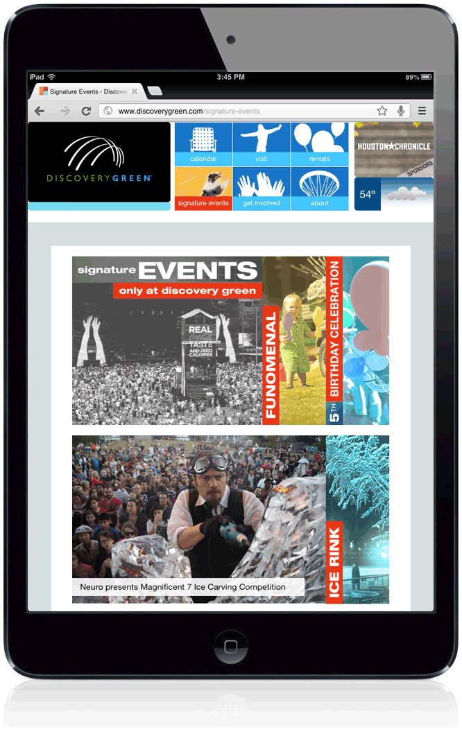
Tablet Layout
Layouts for mobile devices, such as iPhones and iPads, streamline the content by eliminating copy and navigation options that are not ideal for small screens or limited bandwidth. As display width grows, more and more content is revealed.
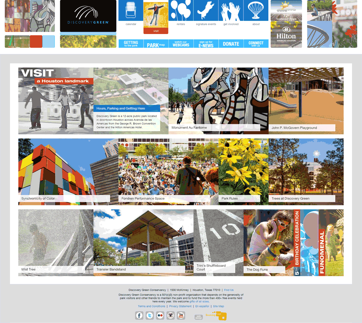
Desktop Layout
A custom-developed content management system was created to meet the exact needs of Discovery Green's busy team. With these tools, they can add/edit/delete content in real-time, create new pages, sequence the content on the responsive walls, alert the public to event cancellations, and manage virtually every aspect of the website.
