


Creating Something Special for an Iconic Houston Museum
Our lives have become all about first impressions. Whether it's your online dating profile or a 140-character tweet, we have mere seconds—at most—to put our best foot forward. So it makes sense that a business' website, since it's a window to the online public, needs to be in top form. It has to be inviting and convey a personality and purpose to the organization's audiences.
Bouncing Pixel has a history of helping its clients create unique and engaging websites by understanding their brand and the message they want to get across. That's precisely what we did for the Children's Museum of Houston.
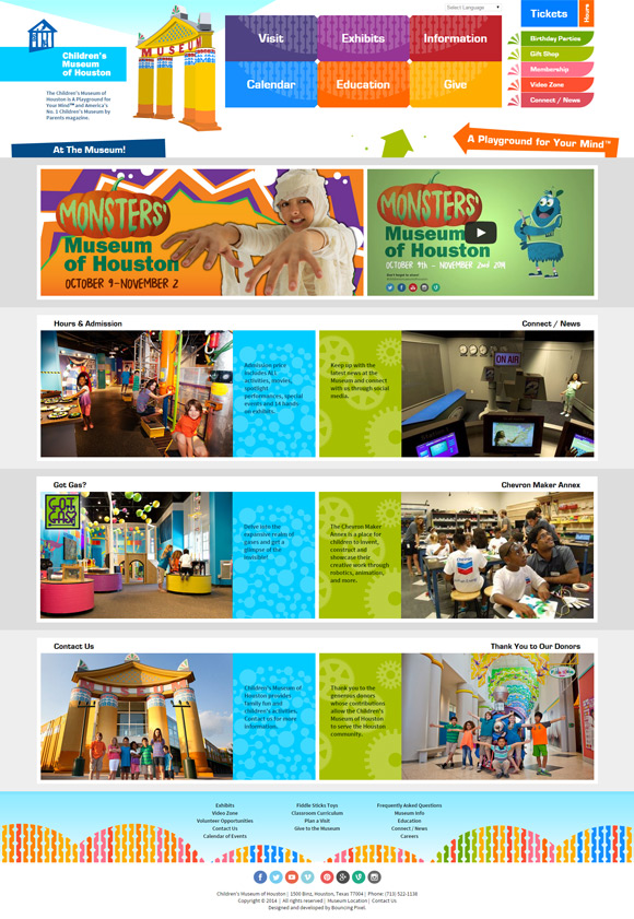
To most people, the Museum's previous website would not have been considered immersive. It got the information out there, but didn't do much to support their public image. The site didn't convey the youthful and animated feeling that patrons experienced when visiting the museum in person. Our goal was to capture that atmosphere and deliver it online with a website designed from the ground up.
Creative meetings were held to discuss what both parties envisioned for the website. This lead to a scenario that comes up often in web development. Clients oftentimes approach new projects with their previous web layouts and limitations in mind. They can be understandably short-sighted in what can be achieved since they're building on an earlier, less flexible plan, instead of starting from scratch.
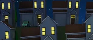
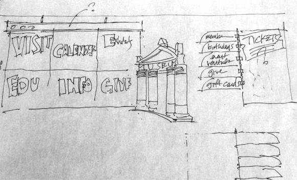 Navigation concept sketch
“Our approach is to start by understanding who the audience is, how our clients intend to communicate through the site, and what the user experience should feel like,” says Jerald. “This is what drives the design, which in turn, drives the technology solution. This method, despite being different than that of most web developers, makes the most sense.
Deciding what technology to use beforehand hinders creative thinking and limits what can be achieved. “We want clients to trust that they can have both: a creative website, and ease of managing content on their own.” So instead of relying on the generic template that the Children's Museum had been using, we brainstormed with them to find fresh ideas before building the tools to manage the site.
One of the first things Jerald did was to visit Museum District. His idea was for website users to feel one small step away from being at the Museum itself. What he saw were the key attributes that make the Museum what it is: a strong graphics vocabulary expressed in its architecture, the interactive nature of its exhibits, and the energy that comes with excited kids running around. An idea took root, and some of his very first sketches are now headlining the website.
The concept to use features of the Museum's design and exhibits went past the home page, and was implemented throughout the site. The industrial water pipes from FlowWorks are shown running behind the Calendar page. Molecular models that kids get to build in the Matter Factory are depicted on the Education section.
Even the colorful fence bordering the Museum, that's replicated inside the building along the walls, is referenced in the footer. The entire site gives online visitors a preview of what they can expect once they're on museum grounds.
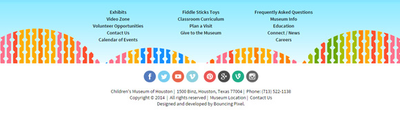
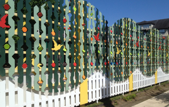 Website footer influenced by architectural graphics
Our work helped the Museum's marketing teams receive a nomination for American Marketing Association's Crystal Award, and Bouncing Pixel received an American Advertising Federation's Silver ADDY for the site in 2015.
Check out our work on the Children's Museum of Houston website, and take a look at some of the Museum's current exhibits while you're there. Release your inner kid, and go have some fun!